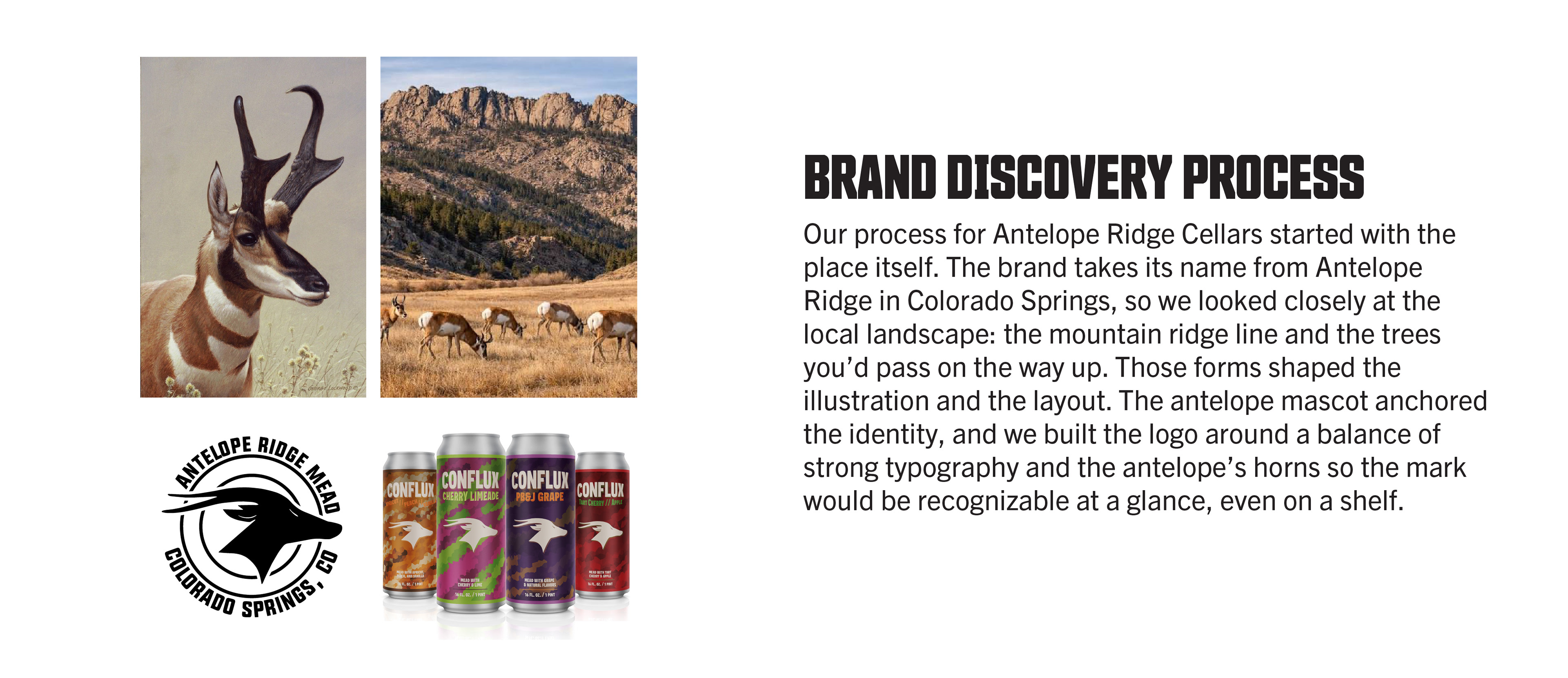


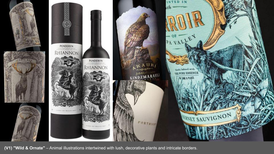

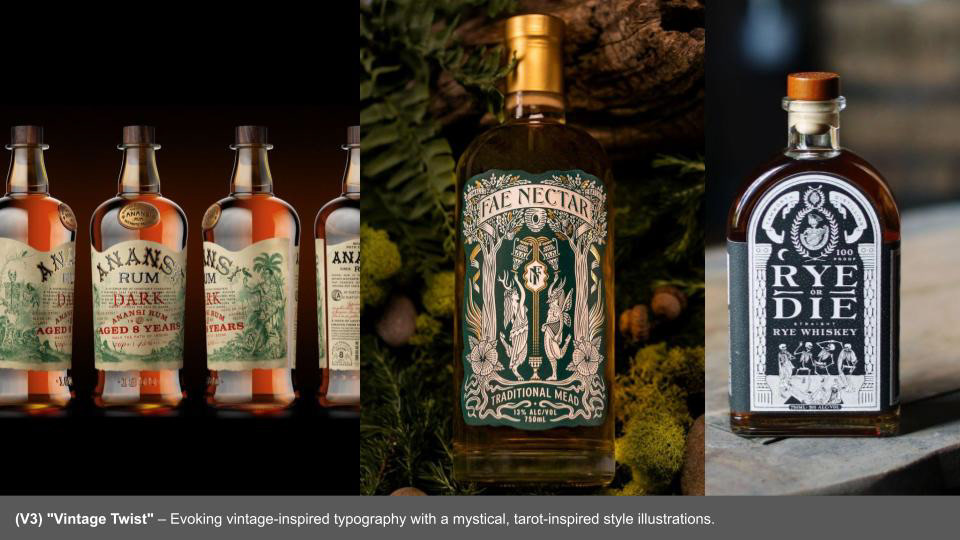
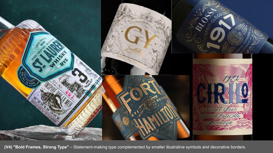

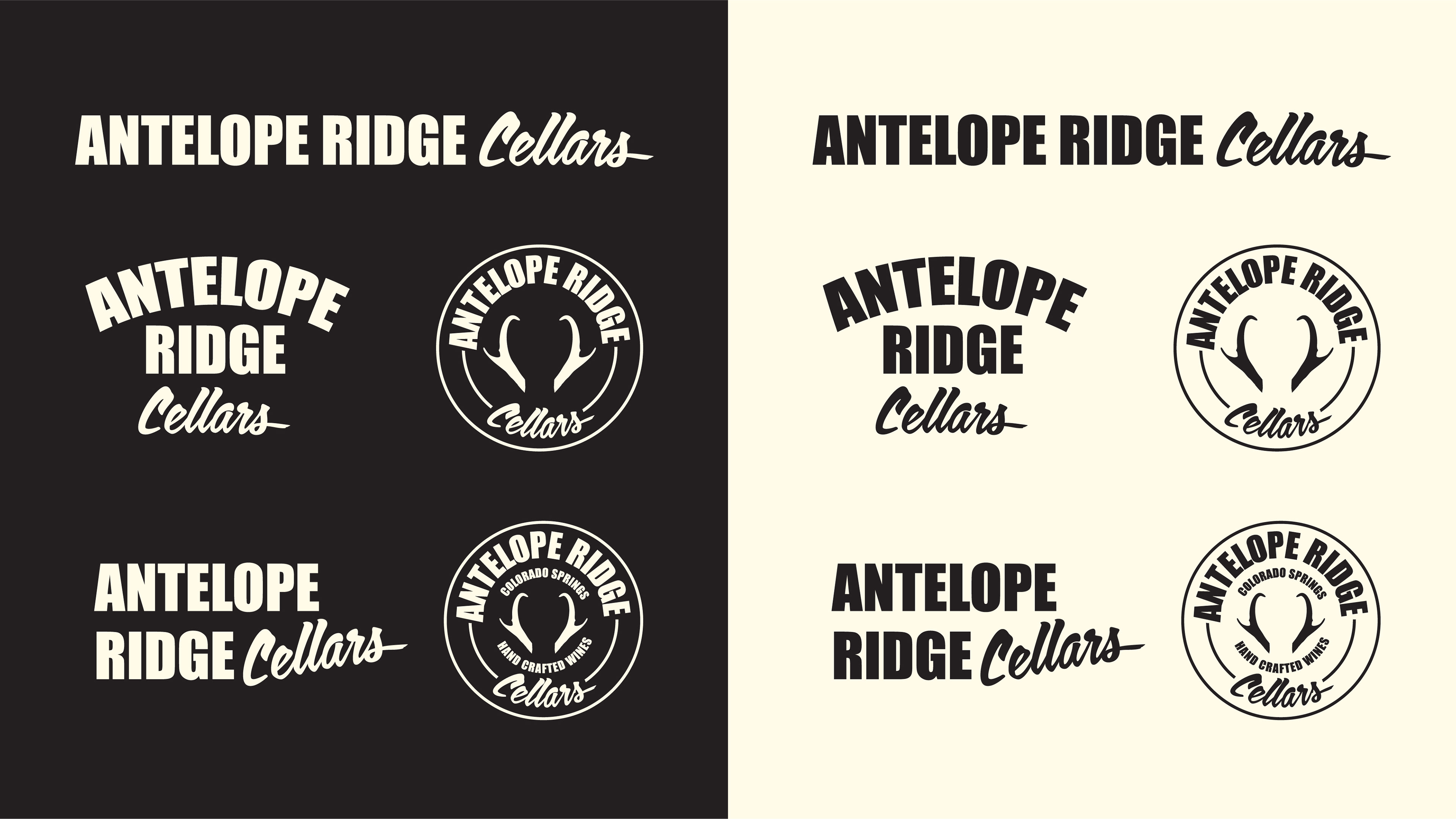

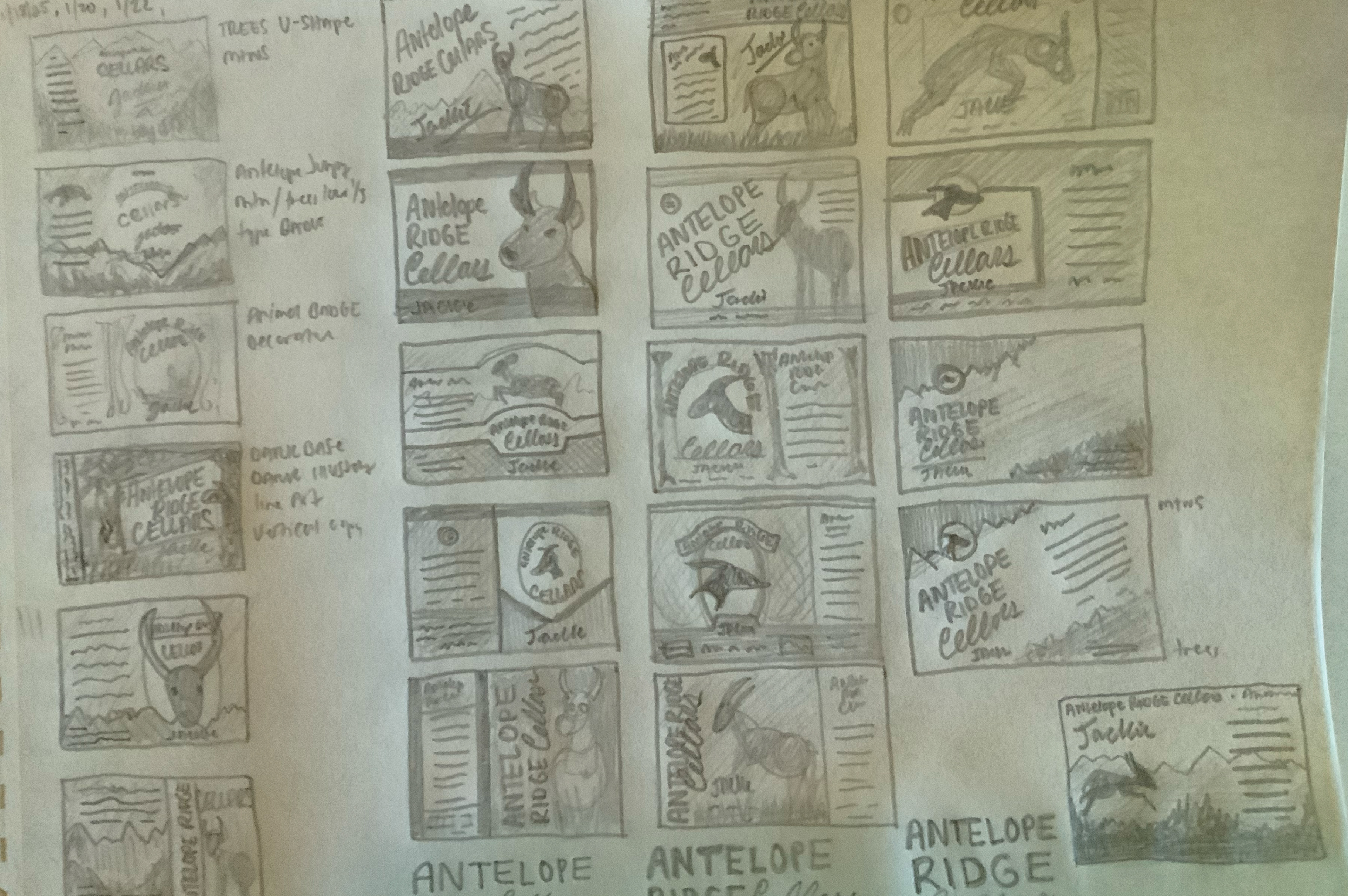
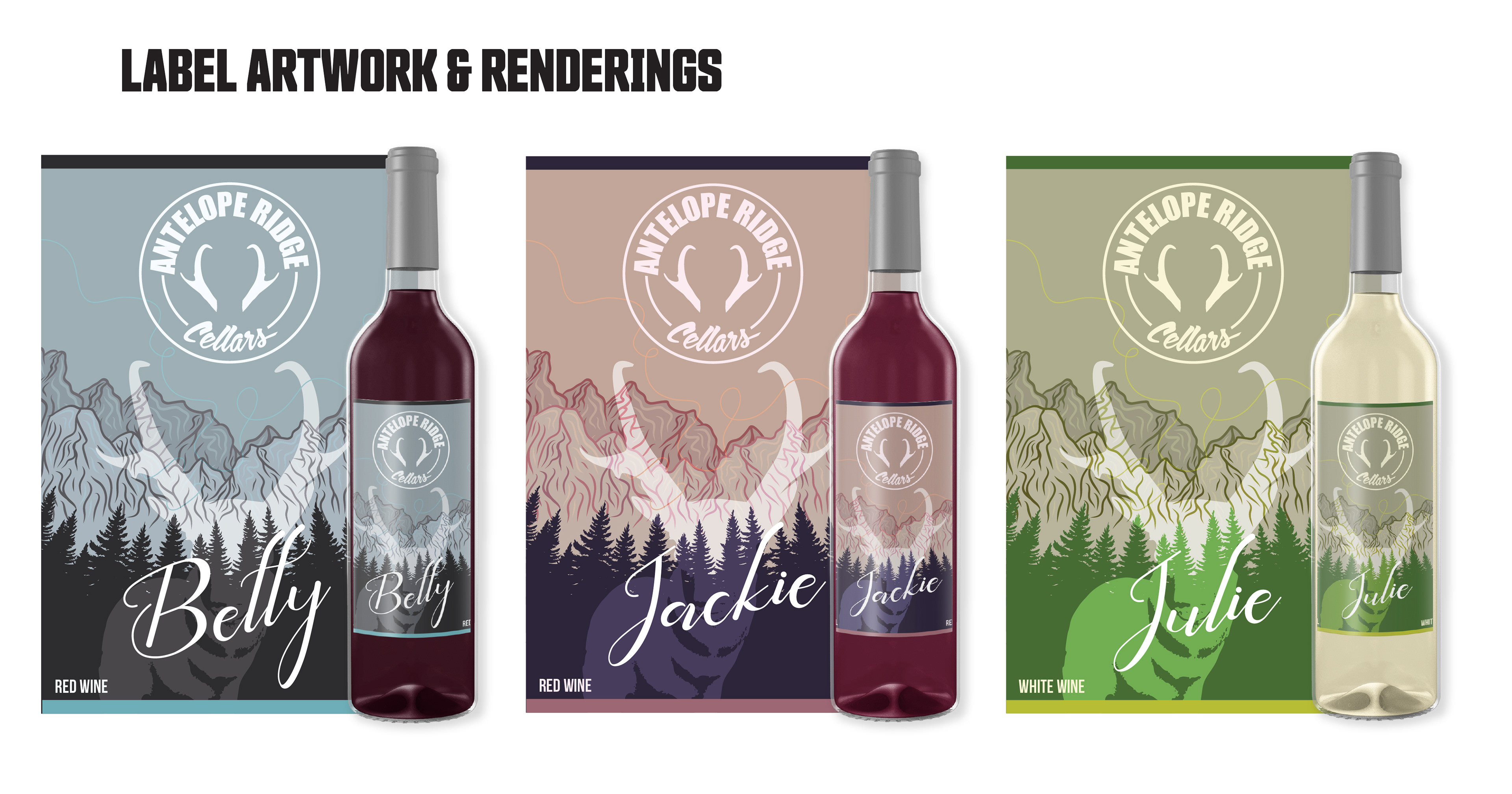
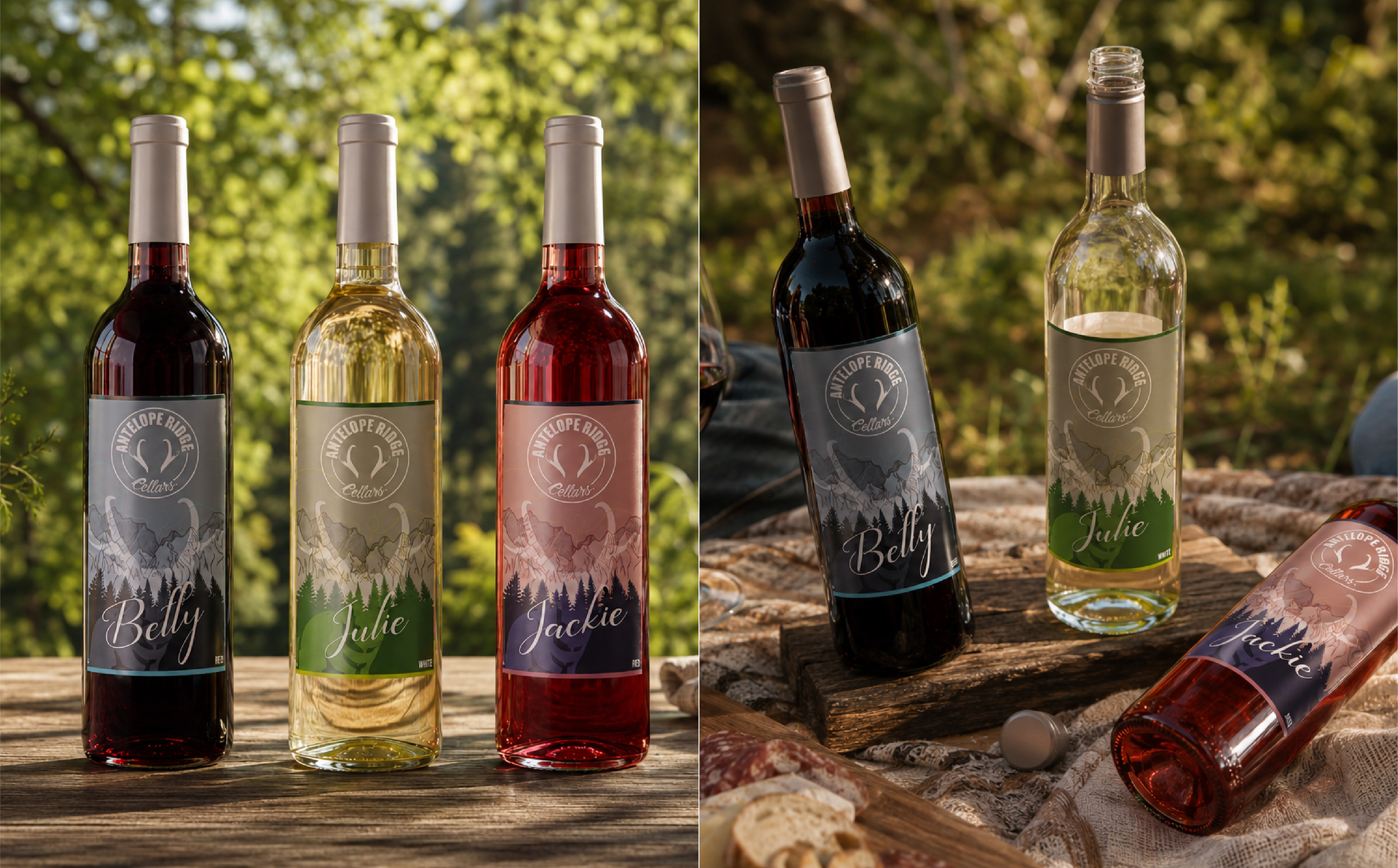
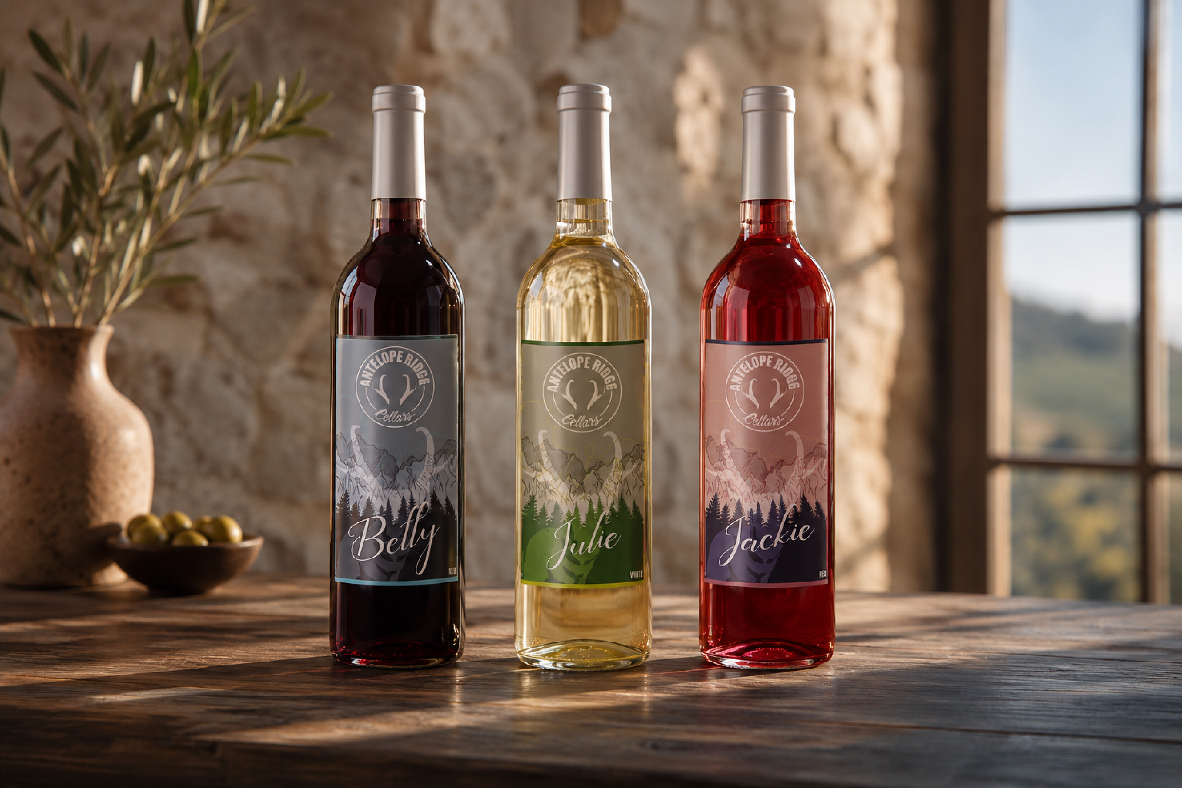

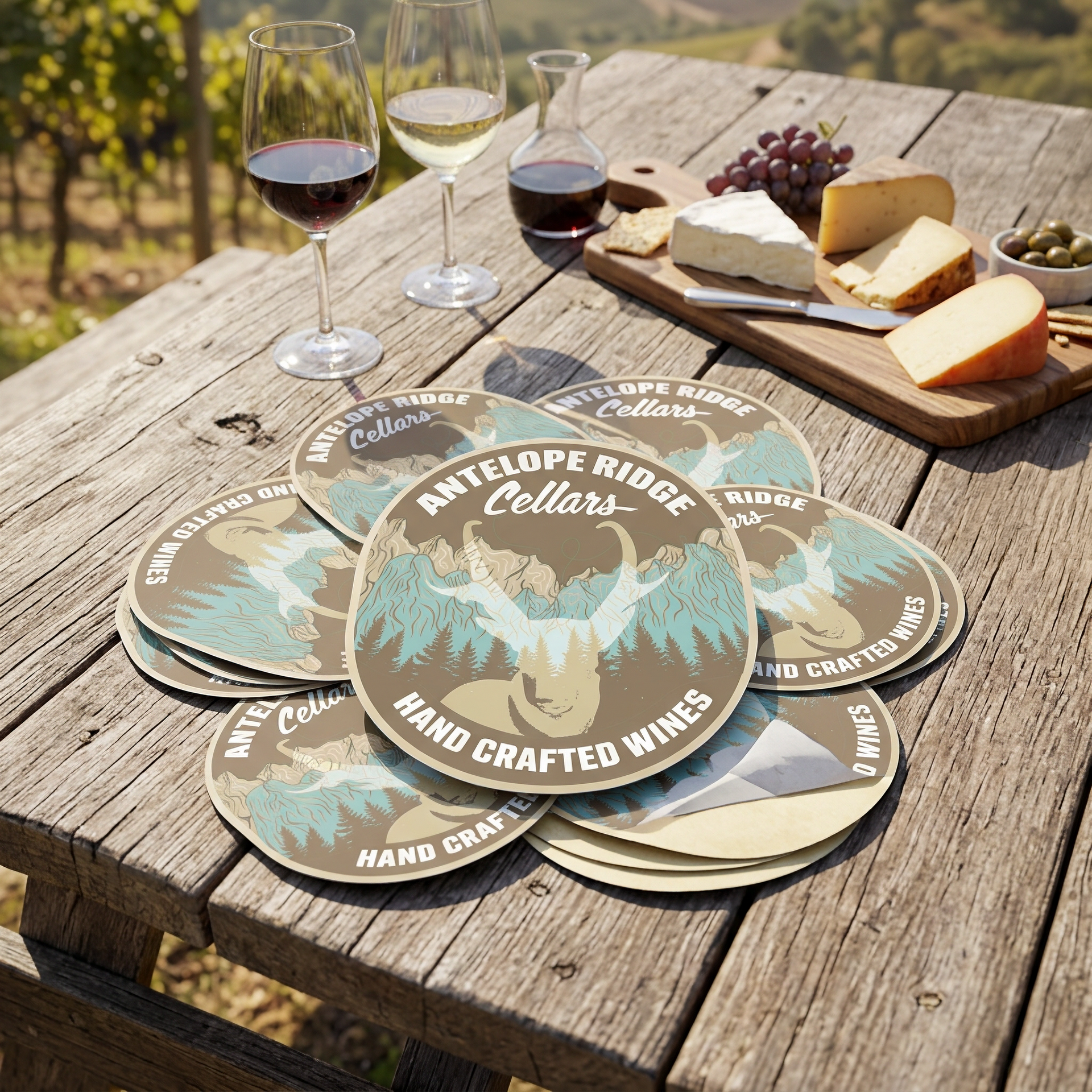

Antelope Ridge Cellars launched its first wine program with three wines, a logo system, and a label template built to grow. Rooted in the brand’s Colorado Springs roots and the local ridge and trees, the identity pairs a bold antelope mark with strong typography for a wine that feels elevated while staying close to the neighborhood brand people already love. Each of the three wines is named for a founder’s grandmother, a personal tribute built into the packaging designed by Clites Creative.